Confservizi Veneto Friuli Venezia Giulia: rebranding, brand system and digital portal
Confservizi Veneto Friuli Venezia Giulia
Association of local public service companies
Strategic analysis, rebranding, brand system, publishing, web portal with courses and e-commerce
An authoritative association that needed an identity worthy of its role.
Confservizi Veneto Friuli Venezia Giulia brings together the companies that manage water, energy, environment and transport in the two regions: more than fifty members, from large multiutility groups to local companies.
It needed a more institutional and contemporary image, credible to companies, public bodies and stakeholders, and a system able to hold many tools together: from the brochure to the business card, up to the members’ portal.
Analysis and positioning
We started from the context: other trade associations, industry benchmarks and the way members describe themselves. The direction that emerged is clear: an authoritative, sober identity, built to last and able to sit alongside members’ brands without losing recognizability.
The new logo
The 2023 logo had a heavy, condensed lettering, hard to read at small sizes and dated next to members’ brands. We kept the symbol, recognized by everyone, and redesigned the lettering: more open, more legible, with a better balance between pictogram and name.
Alongside the positive version we defined the negative version on a blue background, which becomes the signature of all applications.
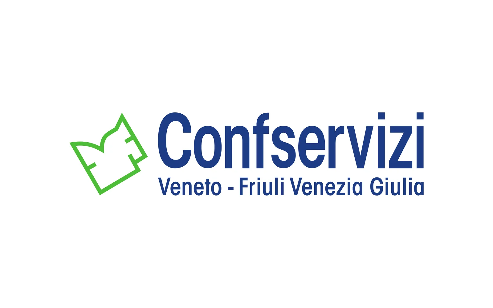 Before · 2023
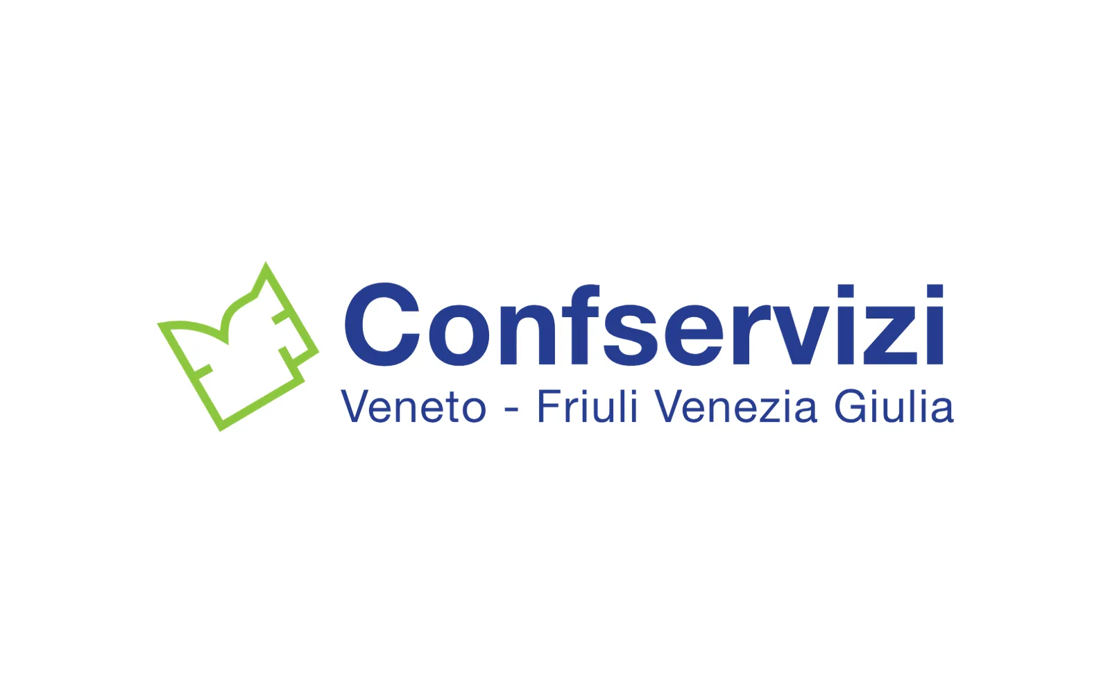 AfterNegative
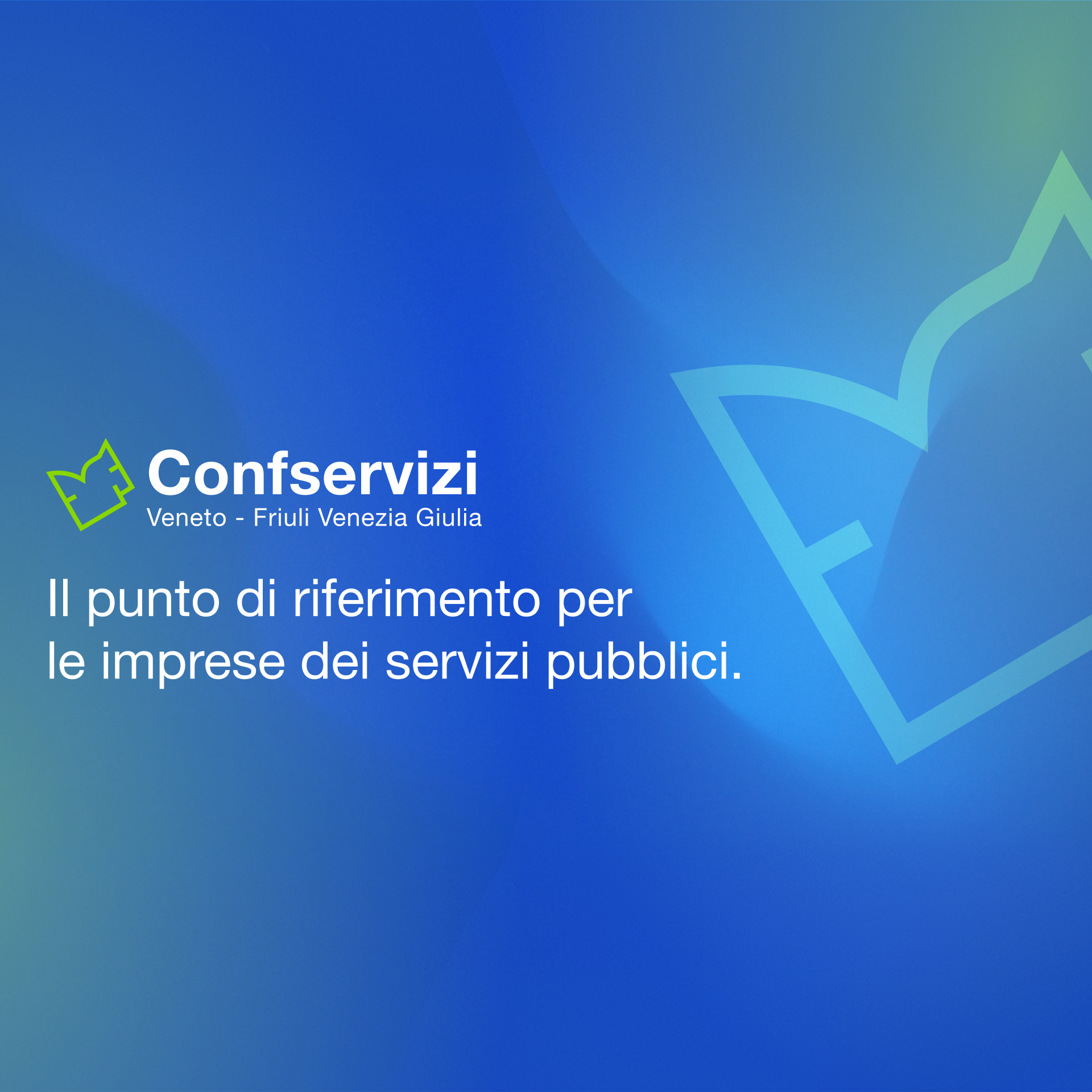 Visual
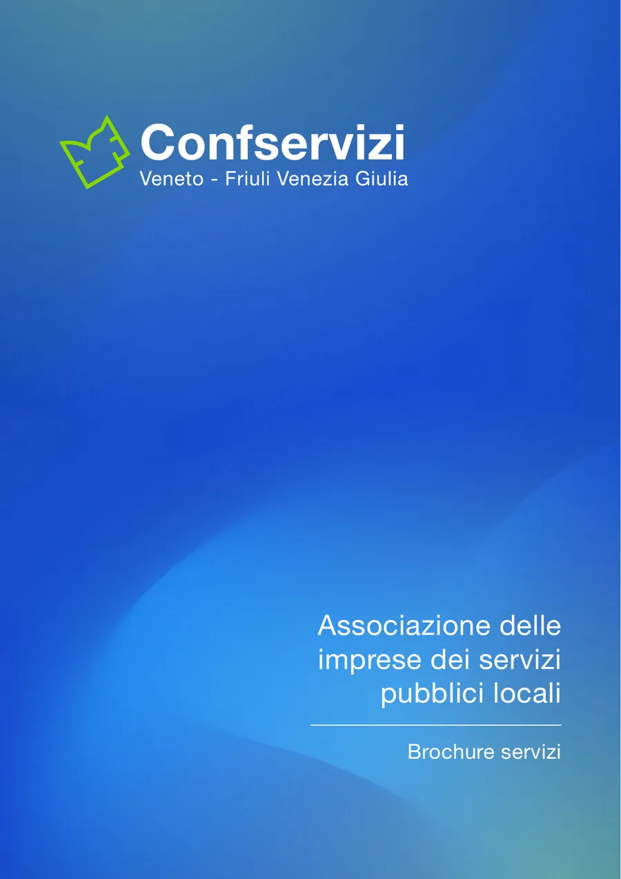
Brand system and applications
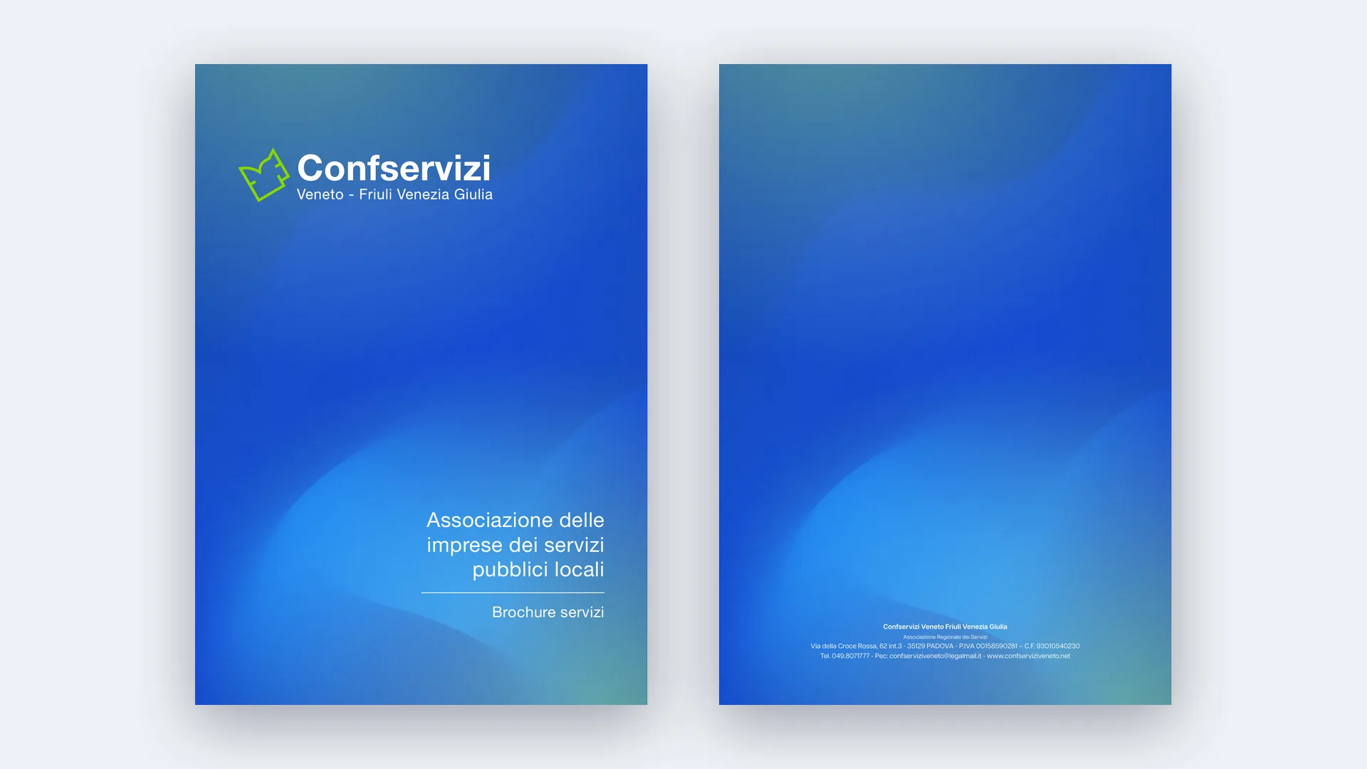
The gradient blue background, the green of the symbol and the pictogram used as a large-scale graphic sign are the elements that hold the system together. We applied them to stationery, institutional visuals and the new services brochure.
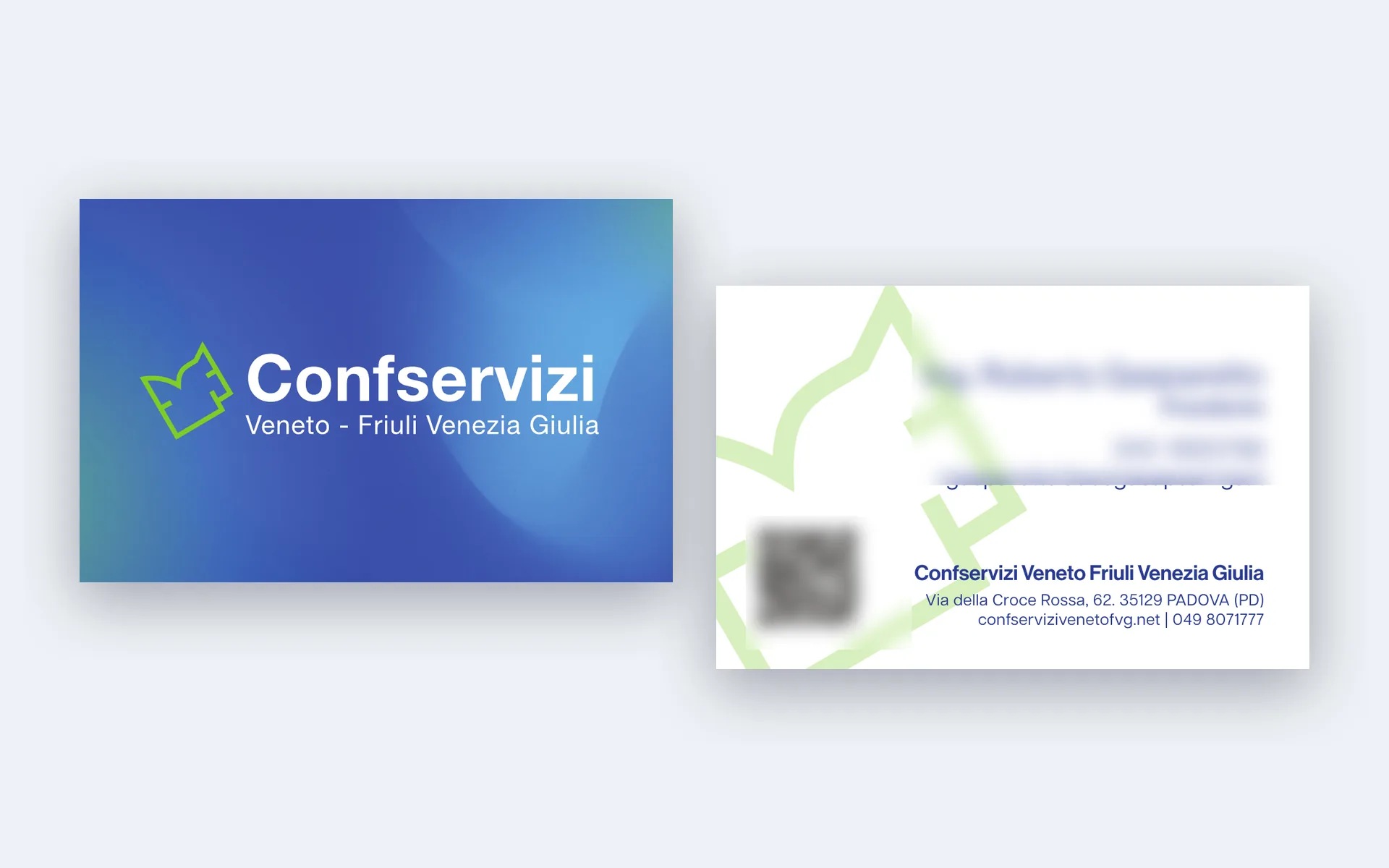 Business cards
2026 services brochure
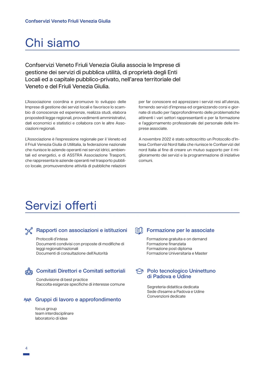
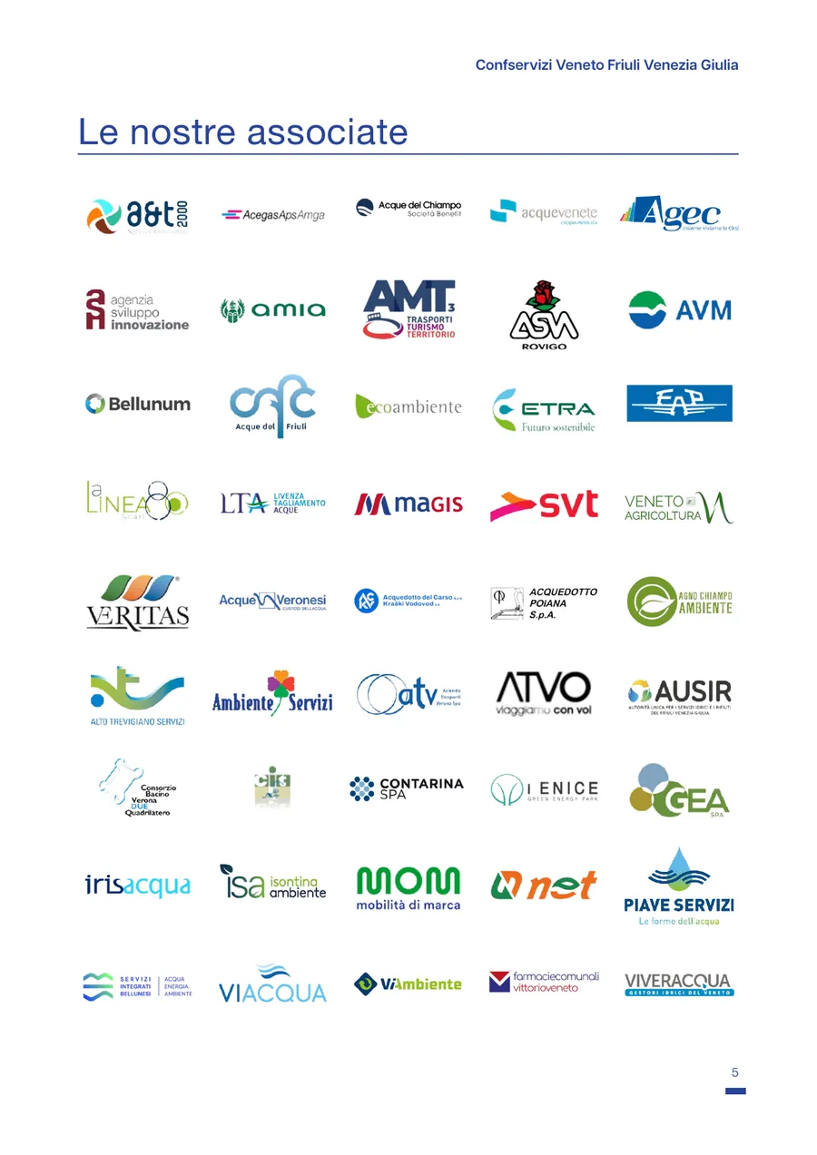
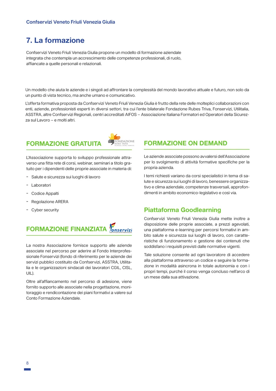
Twelve pages to explain to a company why it should join: who Confservizi is, the members, the services offered, the benefits of membership, training and the Uninettuno Hub in Padua and Udine. We worked on content hierarchy and layout, to make a broad and highly technical offering readable.
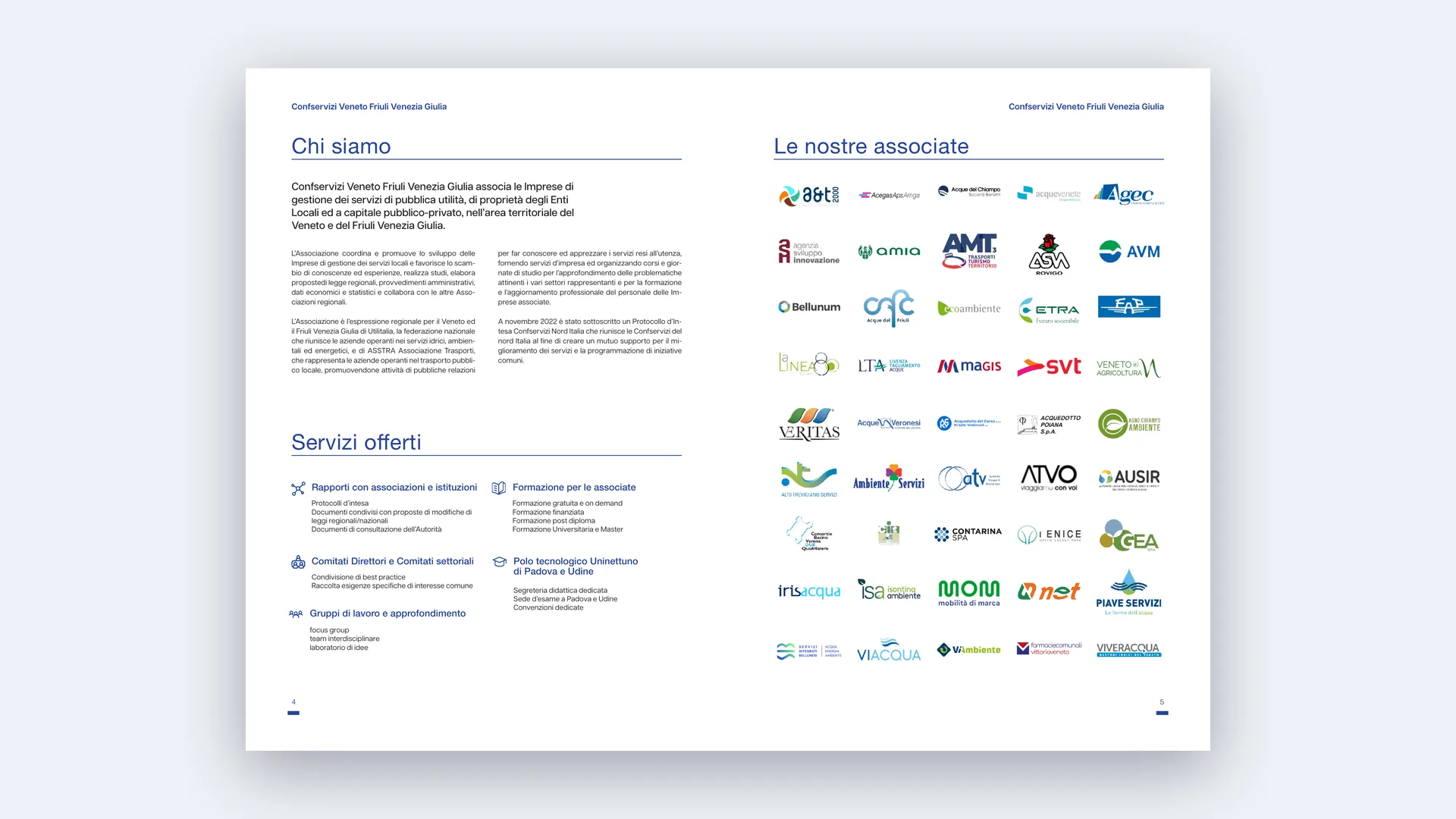 Who we are · Members
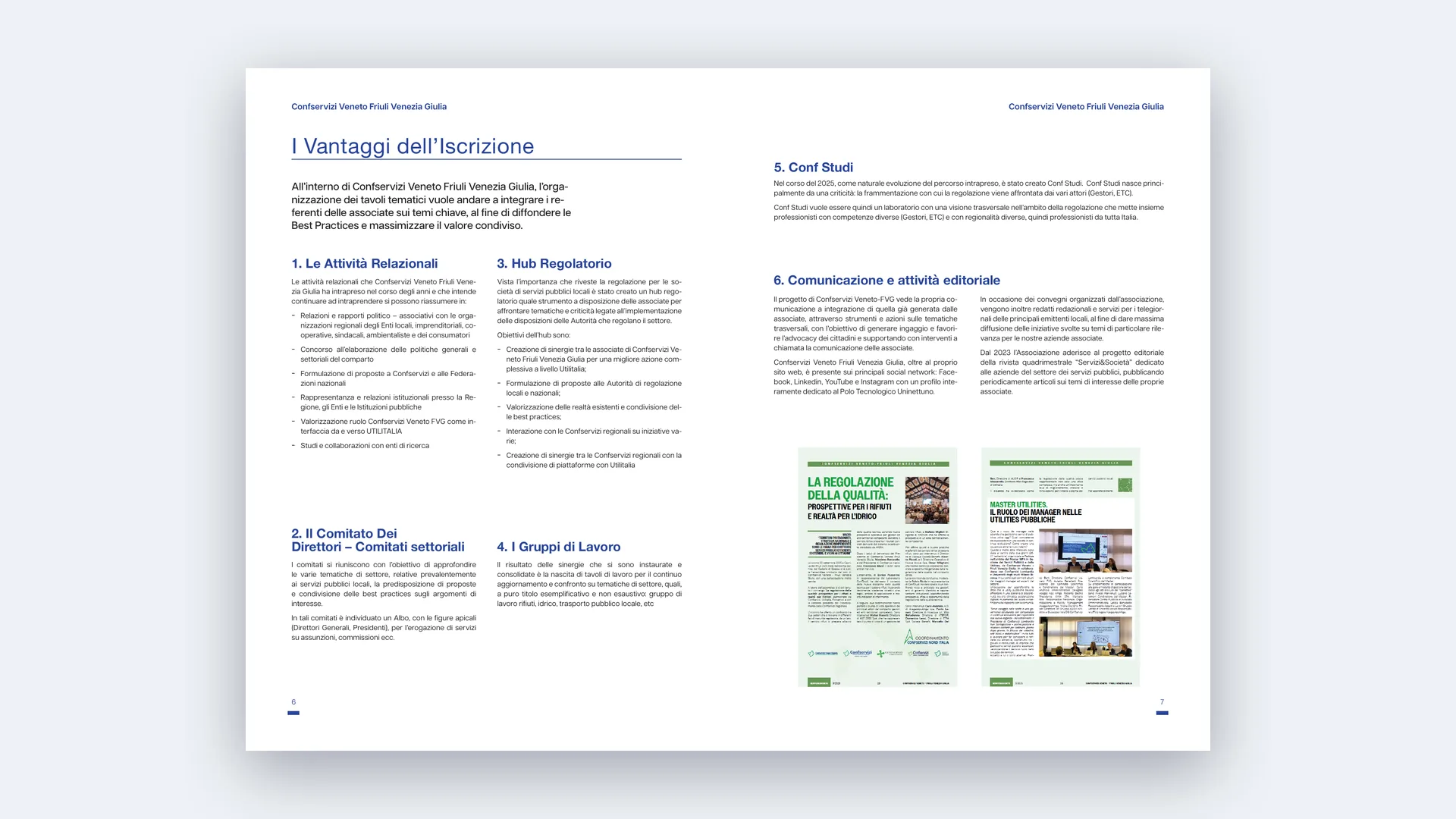 Benefits
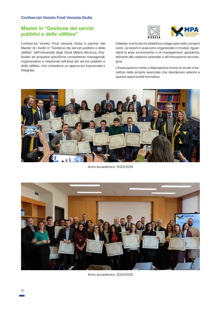
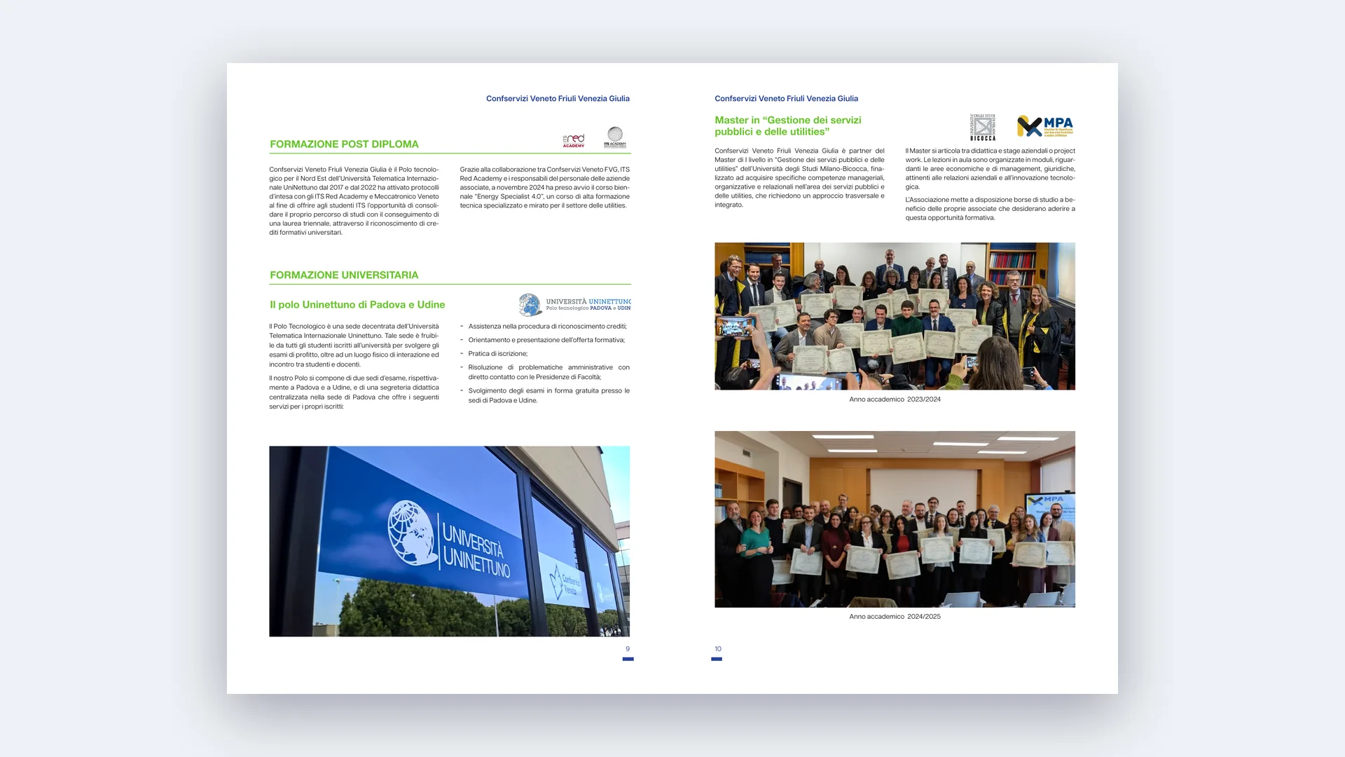 Training
Digital portal
In parallel we designed and developed the new portal: not a simple institutional website but a platform serving members, with course management, a dynamic calendar, a list of training activities and e-commerce to enroll in and buy courses online.
Information architecture and user experience were reworked to make services easier to find and use.
Does your identity communicate your role?
Tell us where you are and where you want to get to. We’ll get back to you to schedule a first video call.
+39 049 5018351
